WESTMORE
BRIEF
Westmore Insure saw real growth in their first few years of business and have continued to do so. Our services were called upon to develop a brand that supported this growth and helped build a reputable image for the company
SOLUTION
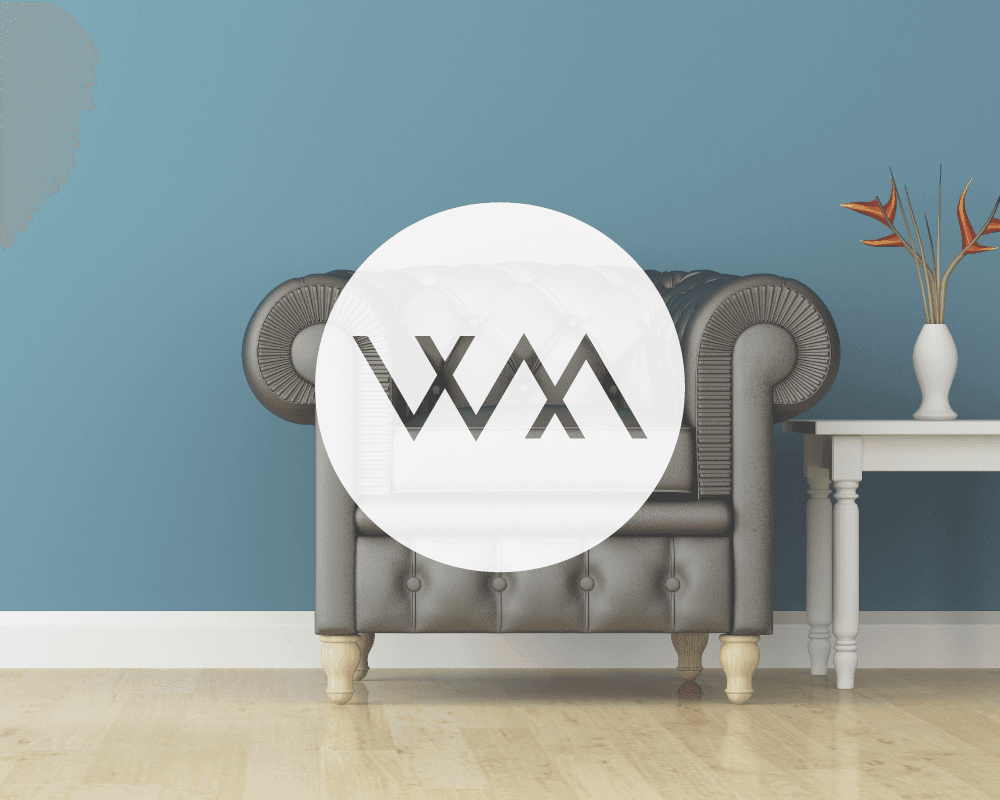
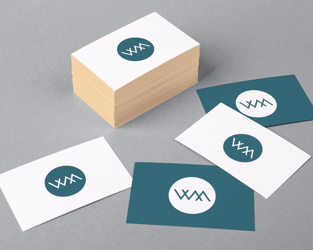
Our approach from the start was to build a modern and intelligent take on the W and M.
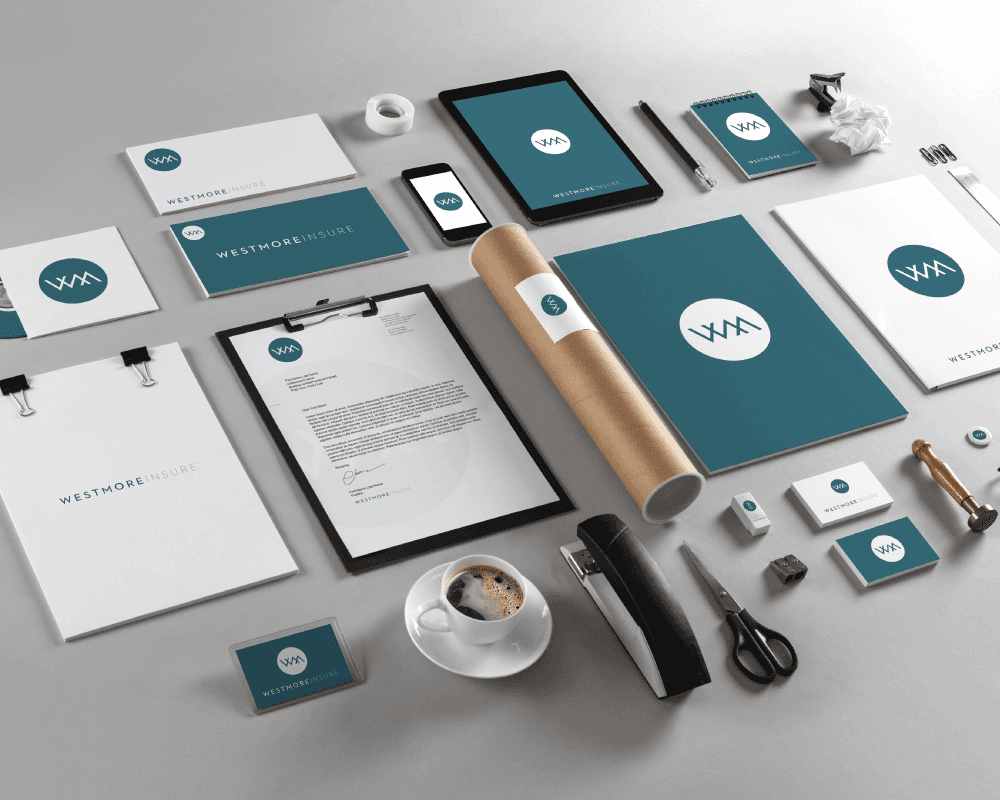
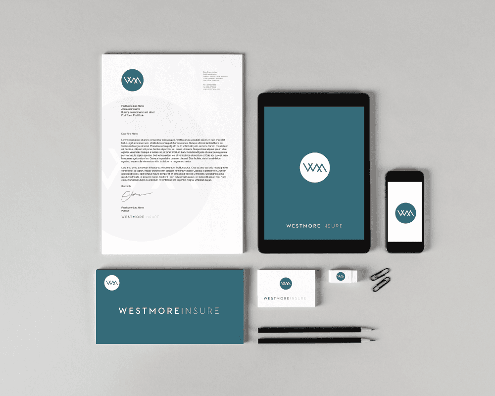
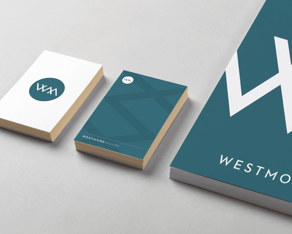
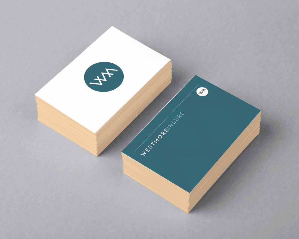
Westmore now have a logo mark that stands on its own through clean and tonal marketing pieces.
The clean and simplistic tone transferred stunningly across print and digital platforms. The type structures and icons have ensured Westmore is now a much more rounded brand.