
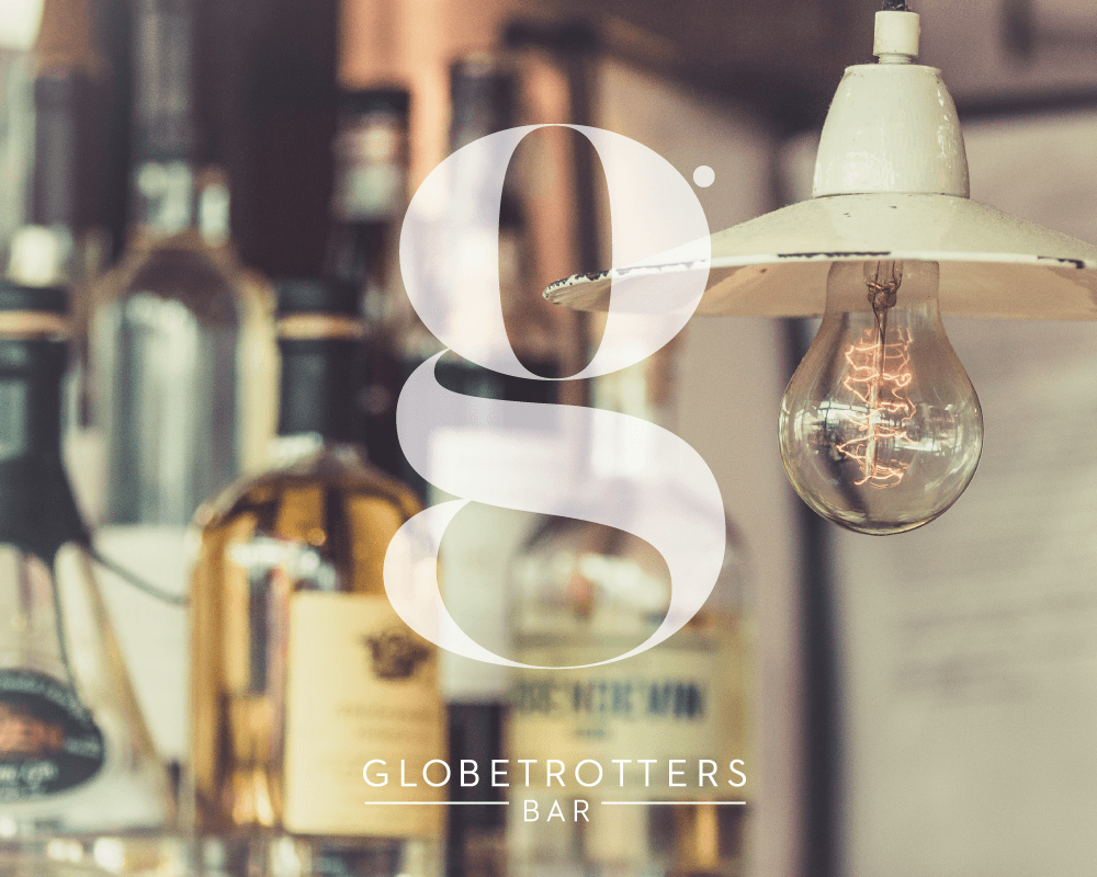
GLOBE TROTTERS
BRIEF
Globetrotters bar is a hidden gem and a favourite with locals, unique for its music and good beer.
They approached us to develop a brand to coincide with their internal makeover.


SOLUTION
The brand was centered around the G logo mark, a bespoke typographic element that is elegant and beautiful in form.
The mark was mainly developed for signage and marketing material.
By using such a classic form with a modern edge we developed a brand that could be used in many different ways while holding its own as an independent entity.


